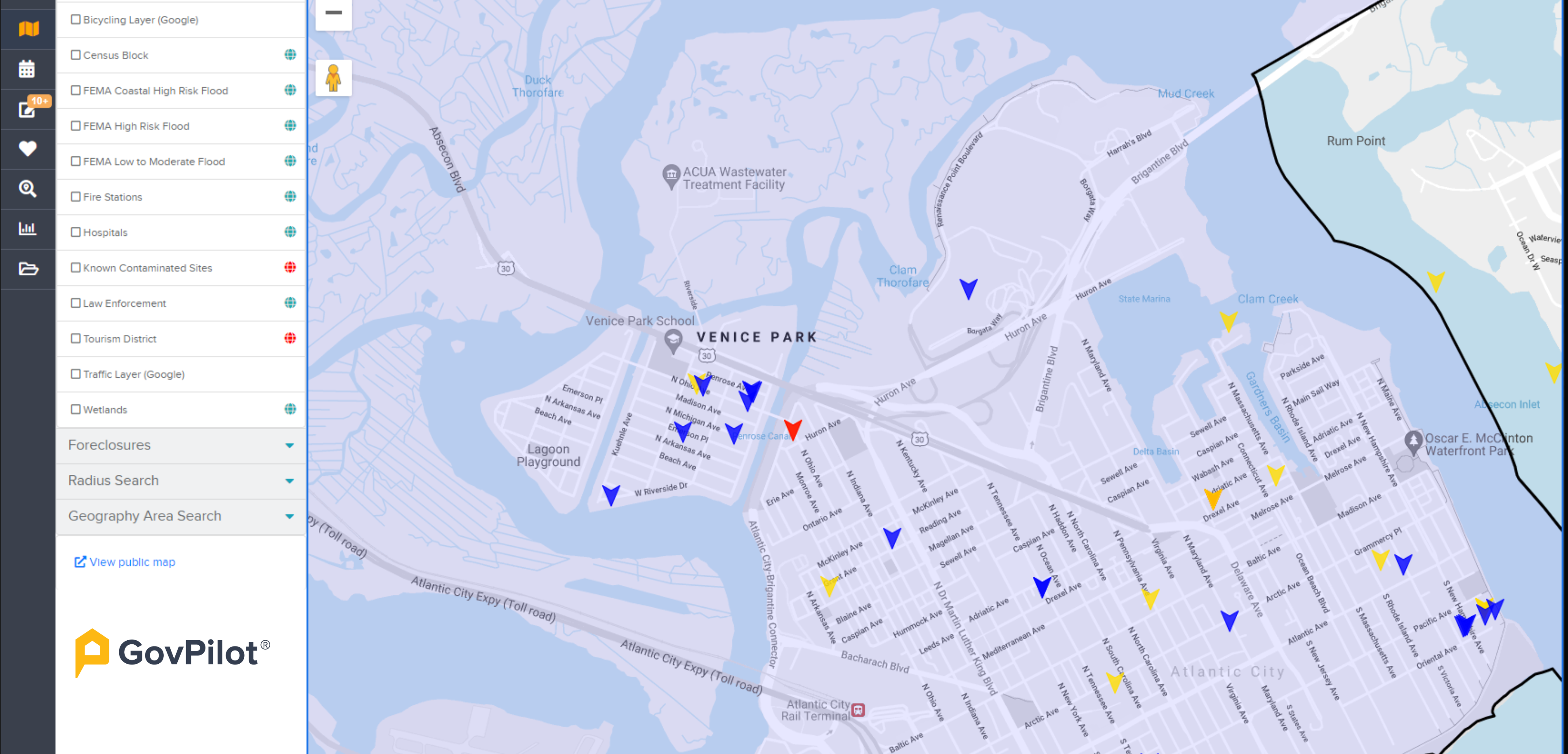
Think of the tools we use to teach children—the storybooks that instill morals, the magnets shaped like letters of the alphabet strung together to form words. What do they have in common? They are all colorful.
As we age, we may learn how to do taxes and cry on the inside, but we don’t outgrow our inclination to retain information visualized in vivid hues. The GovPilot platform’s bright and cheery interface helps constituents and local government employees alike make sense of important data sets.
Vibrant and Visible to the Public
Each municipal website is a carefully curated font of civic information, built according to a color scheme and layout that reflects the values of the town. We would never dream of changing one.
When a client signs on with GovPilot, they choose the modules and website button style that best fits their needs.The button works as a kind of advertisement for innovation—capturing constituents’ attention and carrying them to the corresponding digital form.
.png?width=571&name=Screenshot%20(283).png)
Haledon, NJ is one client that takes advantage of GovPilot's free website button design services.
Many clients also opt to publish GovPilot’s geographic information system (GIS) map on their website.The GIS map illustrates the locations of public transportation hubs, historical districts and anything else the administration would like to highlight. Adjustable, color-coded map layers bring these data sets to life.

The View from City Hall
Like all of the best candy, a beautiful shell is just the beginning. The inside is just as great (we’re looking at you, Tootsie Pops!). Since we introduced our Jet interface, government employees are abe to see critical data sets with color-coded clarity.
Upon login, local government users encounter Jet’s Dashboard—a custom arrangement of colored tiles that allows users to access project status and employee productivity.

Dashboard is just one of Jet’s visual delights. Its image-centric PropertyProfile and internal GIS map features help government employees identify patterns, analyze trends and plan initiatives at peak efficiency.
Data visualization is an important step towards data literacy and GovPilot is proud to move it forward with our software’s eye-catching, easily digestible user interface.


