
Anecdotes and data are two of the most powerful tools in the government storyteller’s kit. Highlighting the story of a young mother whose commute will be made safer through infrastructure improvements is an effective way of explaining why the improvements are needed, and using traffic data to show just how important they’ll be helps solidify that point.
There are powerful stories hidden in columns of data, but most humans lack the skill to see it at a glance. That’s why visualizing data with charts, graphs, and geographic information system (GIS) maps is so important – it’s the lens through which we’re able to make sense of it all.
When it comes time to share your government agency’s successes and tell its stories, you should be considering maps. Maps are a powerful way to share information with your constituents, and the interactive nature gives them the tools to explore the data and uncover their own stories.
Using GIS maps can:
Anchor users to the bigger picture. A list of corridors slated to have improved safe school routes is one thing, but a map layer provides visual context. It lets the viewer connect the data not only to the city as a whole, but it allows them to see the role it will play in their lives.
[Tweet "#GIS maps help constituents see the role city initiatives play in their lives."]
Draw comparisons between different data sets. How is the big picture changing over time? Maps can show a decrease in crime, an increase in park facilities, a shifting center of poverty, diminishing food deserts, and more. This can tell the story of increasing need, or highlight the success your organization has had in making change.
[Tweet "#GIS maps demonstrate to constituents how the big picture is changing over time."]
Explore patterns. Organizations like EcoTrust have been using maps to tell stories for decades, a practice that allowed them to draw surprising conclusions about how patterns in rain forest loss, watershed condition, and the status of First Nations languages were interrelated.
[Tweet "#GIS maps help users see surprising patterns, and draw their own conclusions."]
Highlight the need for a program or initiative. Maps can be a key part of marketing a new initiative to constituents. In Southern California, the San Diego Association of Governments is using an interactive map to engage the public about improvements along the LOSSAN rail corridor.
[Tweet "#GIS maps engage the public in city programs and initiatives."]
Help the viewer understand how a bigger issue impacts them. Journalist Kathryn Torney won the Royal Statistical Society’s 2013 Statistical Excellence in Journalism Award for use of maps in her piece on segregation in North Ireland schools. Whereas a straightforward journalistic piece would have called attention to the problem, the addition of the maps allows the reader to understand how they are impacted.
[Tweet "#GIS maps help constituents understand how bigger issues affect them."]
Highlight successes and stoke civic pride. When the City of Boston faced record snows last year, they chronicled how they dealt with it in a series of maps called the Snow Journal. Other ways to stoke civic pride using maps include creating walking tours of historic locations or creating historical layers to encourage people to learn more about their city.
[Tweet "#GIS maps highlight city successes, and stoke civic pride."]
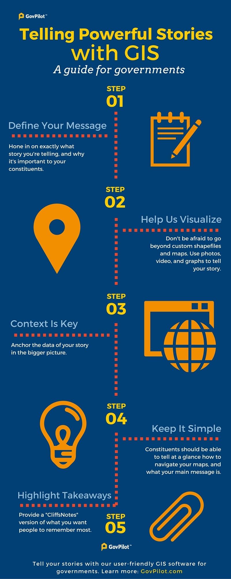
Telling an effective story with GIS
Define your message: Before starting your map, have a clear idea of what your central message will be. Choose a message that demonstrates the importance of the topic to the viewer.
Help us visualize it: Don’t be afraid to go beyond the map, with photos, graphs, and even video (either embedded in or linked to from the map). The more multi-faceted and visual your data’s story is, the more accessible it will be for your constituents.
Context is key: Tie your maps in to greater context. Why is this data relevant to their lives? Why should they care? Link to more information if people want to go deeper.
Keep it simple: Your maps and information should be simple to navigate and simple to understand. Constituents should be able to tell at a glance how to use the map, and what you’re trying to say.
Highlight takeaways: Not everyone will take the time to thoroughly dive into your maps. While the depth should be available for people who want it, you should also provide a “Cliff’s Notes” section with the biggest takeaways for people who only want to skim.